The Roll20 Team
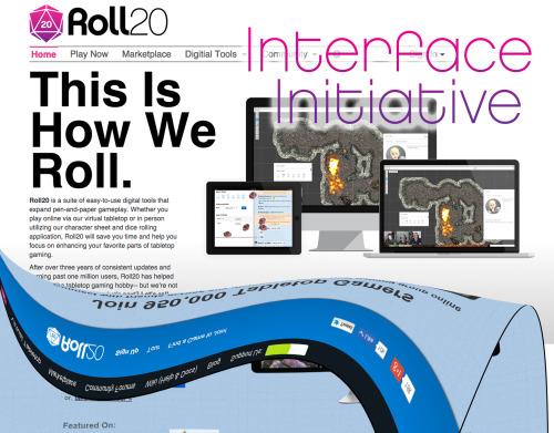
We’re pleased to announce our summer update, the “Interface Initiative” (check out our video chat about the update here). After three years of building an increasingly complex sitemap without a design overhaul, we’re very happy to take a moment to polish both site navigation and appearance in a way that will truly impact day-to-day use of the program.
Working with the conceptual art of Roll20 logo-designer and all around good guy Dylan Todd, we’ve been able to distill the site down to a better functioning, more visually appealing look.
Here’s a preview of the design work– please note that additional changes are being made in the actual implementation:

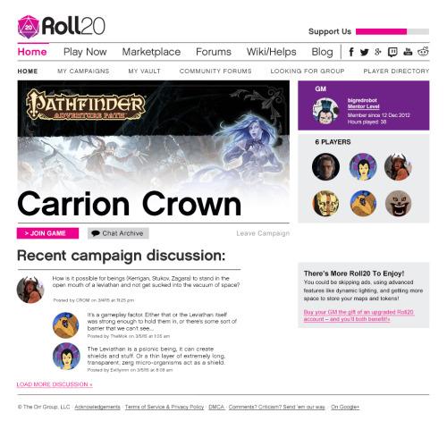
One important change from what you can see there conceptually is that we’re reworking the sitemap to remove the current double-bar redundancy.... here’s a look at developer Steve Koontz’s work at implementing topic-related pull down menu’s instead:
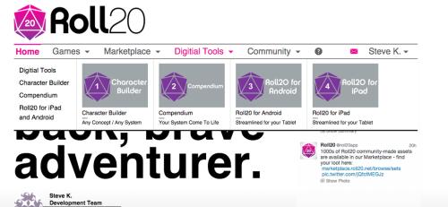
Lots more of this to show in the coming months.
In addition to the visual and navigational streamlining of the site, we’re also planning on...
-
Improving 3D dice with new appearances, increasingly optimal graphical performance, and percentile dice.
-
Adding additional content and systems to the Roll20 Compendium.
-
Furthering the scope of Roll20 for iPad and Roll20 for Android by including macros and additional journal content.
All-in-all, we’re very excited about this undertaking, and hope you are as well!
